jQuery(".blogBaslik .elementor-heading-title").html(jQuery('.entry-title').html());
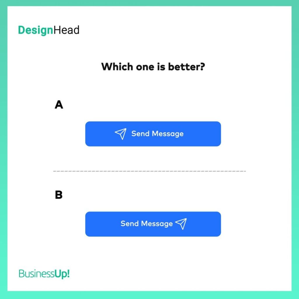
Should the icons used with the message be on the left of the text?(A) Or should they be on the right?(B)
The call to action we use on the buttons are important. It should consist of a maximum of 2 words, and it should speak with the imperative mood. For example; While “Send Message” is a correct call to action text, “Leave Message” is an incorrect usage example🤷♂️ The most correct icon usage in the button; we can say that it is the use of only icons without text. If only the icon is insufficient to explain to the end consumer what the button should be used for and if there is a text, this icon should be placed on the right of the text(B). Icons on the left of the text; weakens the expression of the call to action, as it is similar to the use of a brand logo🤌
Paylaş
Having Difficulty
Growing Your Brand?
Fill the form,
Let's see the result together.
Get a FREE
Brand Check-Up
