jQuery(".blogBaslik .elementor-heading-title").html(jQuery('.entry-title').html());
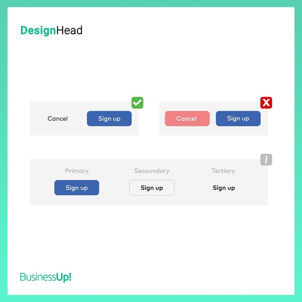
If the website or application is targeting sales, it should provide the right direction. Buttons such as “Cancel” or “Close” are thought to be chosen in red and derivative colors by most brands to convince the user of another positive option. This is a wrong synthesis because if the negative option is more prominent than the positive option, the user will move away from the target buttons such as “Confirm Order” or “Sign Up”🤦♂️ Also, button texts should consist of a maximum of two words. For example “Confirm Cart”, “Continue” or “Complete Order”. Therefore when approving your designs and choosing call to action, let users focus quickly on positive options👌
Paylaş
Having Difficulty
Growing Your Brand?
Fill the form,
Let's see the result together.
Get a FREE
Brand Check-Up
